CAREALL SNACKS - İSTANBUL
Careall Snacks, sağlıklı atıştırmalıklar üreten, ithal bir ürün imaji yakalamak isteyen, tedarikci ve uretici sifati ustlenen bir gida isletmesi.
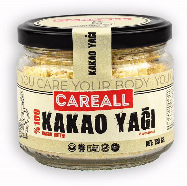
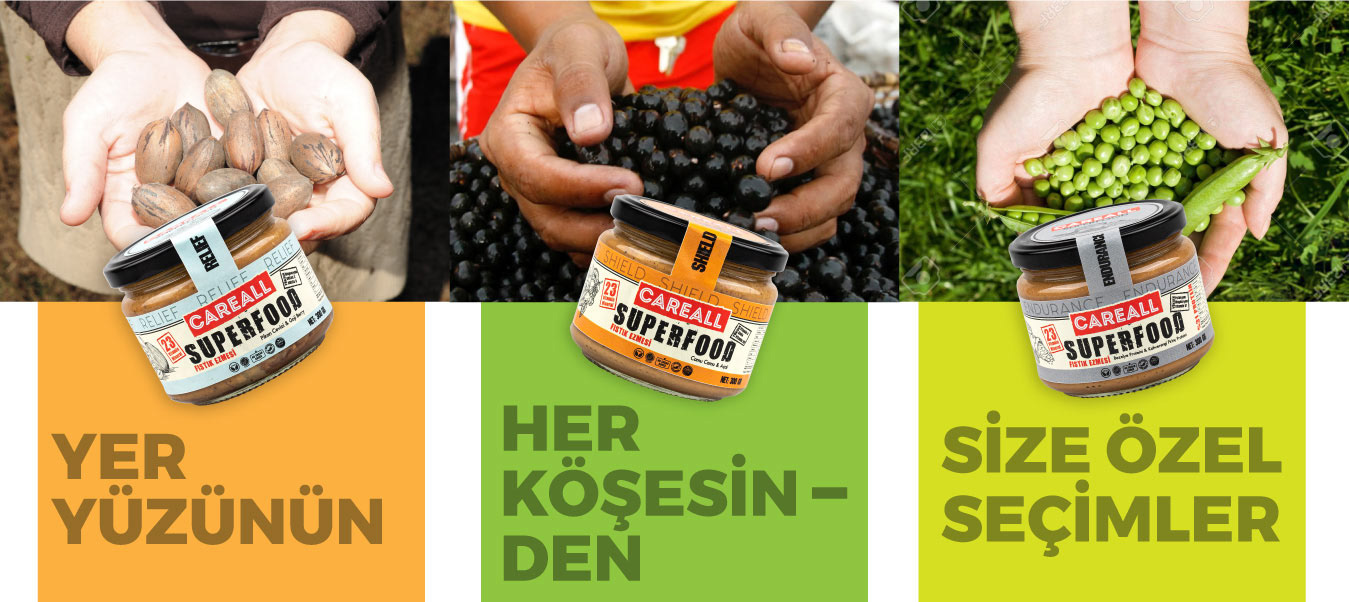
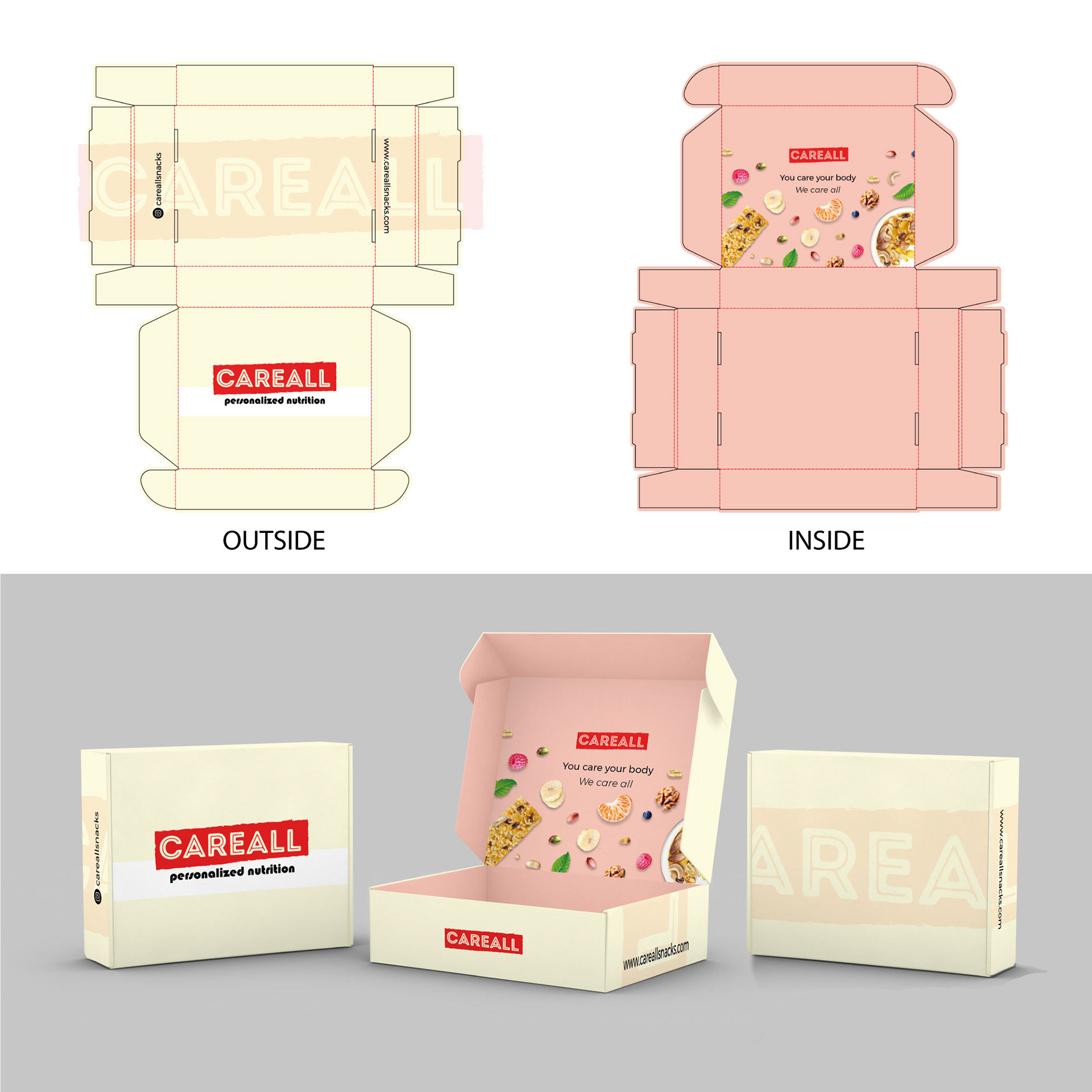
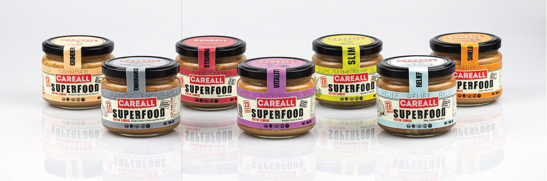
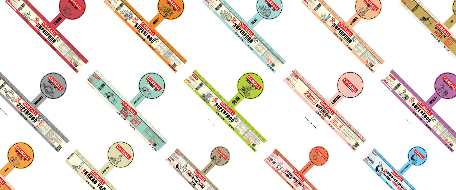
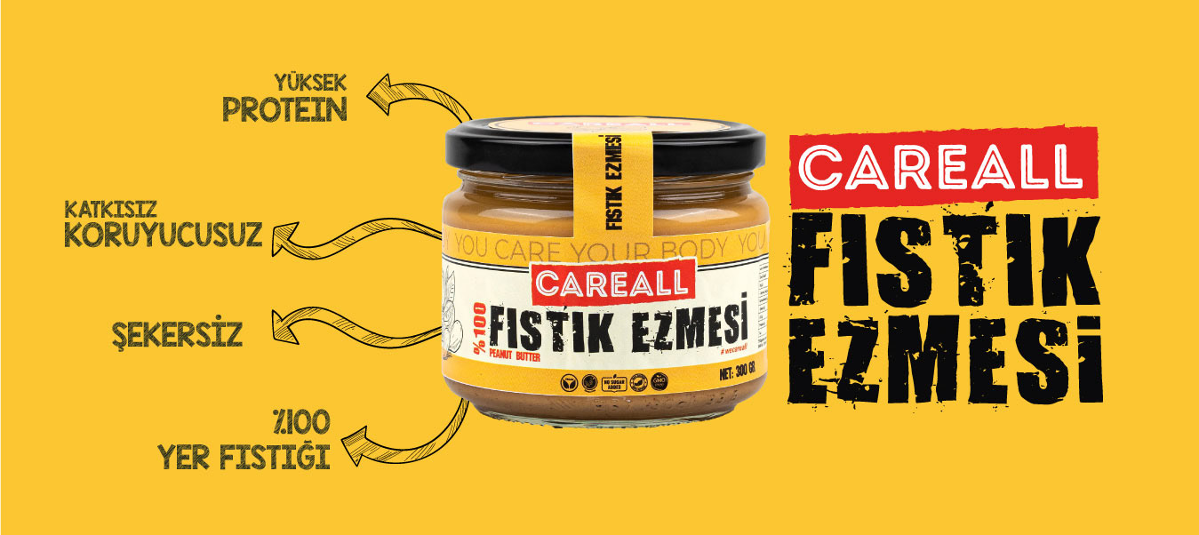
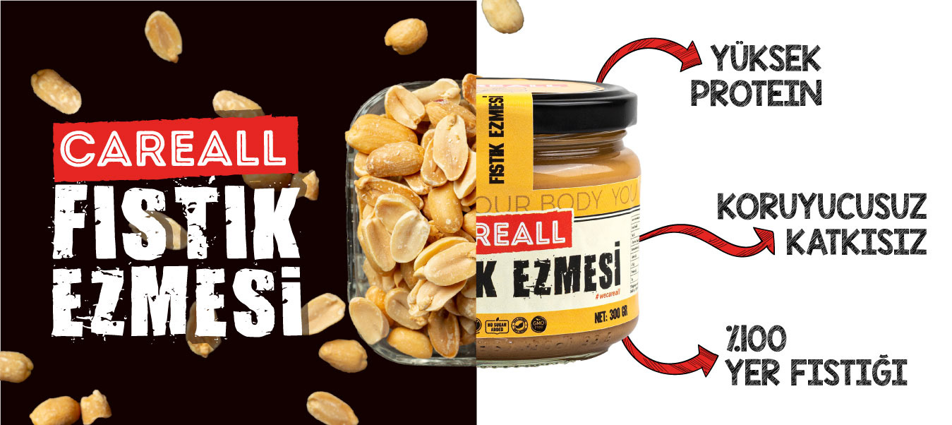
Careall için hazırladigim logoda, hem isminin fonetiği gereği hemde gıda ambalajlarında sadeliği yakalaması için tipografik crunchy bir logo hazirladim . Yaptığım diger ambalaj ve etiket tasarimlarinda ise her zaman öncelikle saglikli gorunmesine dikkat ettim. Sonrasinda ise ürünlerin bütünlüğünü korumak için renk paletini tamamen pastel tonlardan seçtim. Aşırı renklerden kaçınmamın sebebi organikliği ön planda tutmaktı.
***
"Careall Snacks" is a food business that produces healthy snacks, aims to create an image of imported products, and takes on both supplier and producer roles. In the logo I designed for Careall, I created a typographic, crunchy logo to capture the simplicity both phonetically and to match the simplicity often found in food packaging. In my other packaging and label designs, I always prioritized a healthy appearance. Afterward, I chose a color palette entirely consisting of pastel tones to maintain the integrity of the products. The reason for avoiding bright colors was to emphasize the organic aspect.